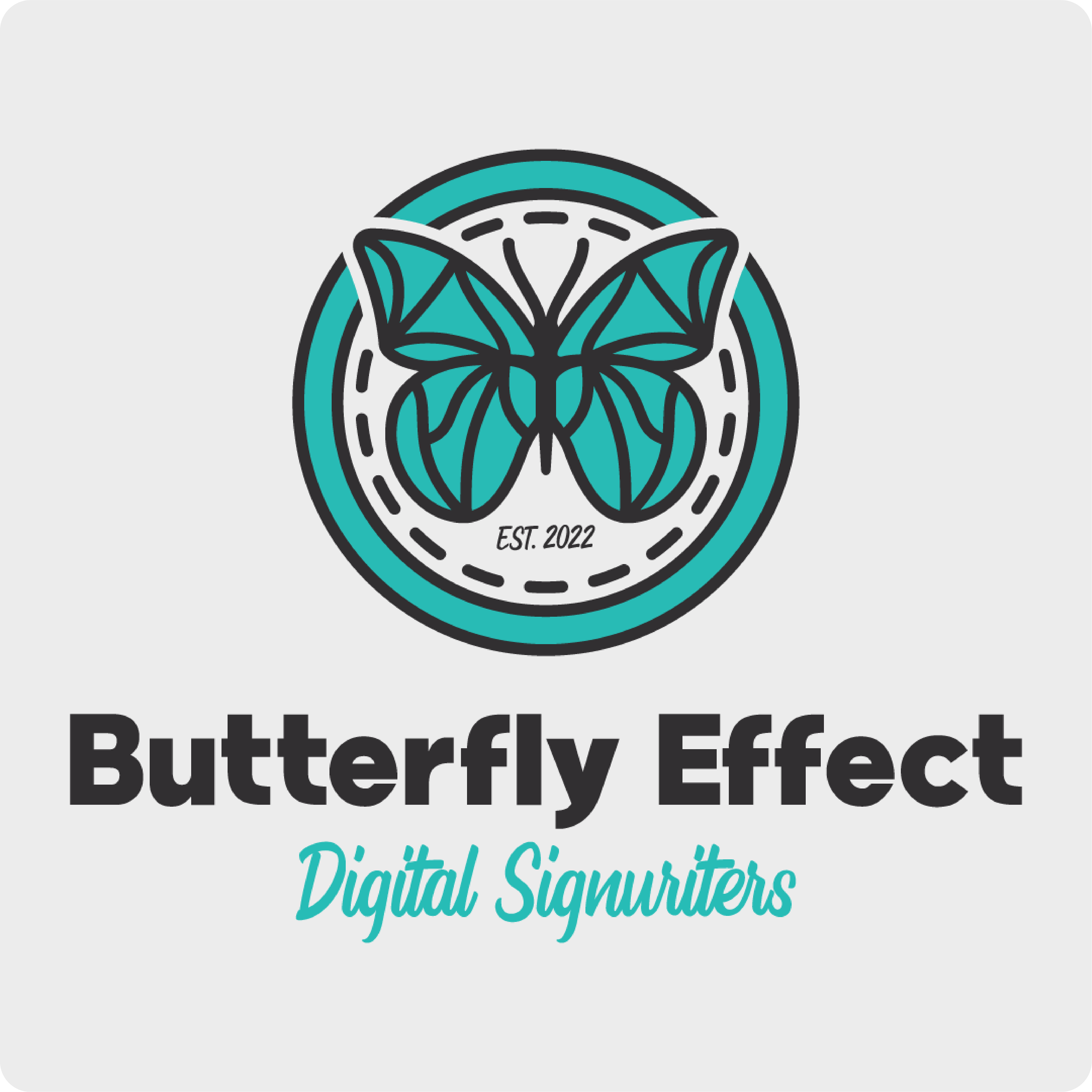
Butterfly Effect approached Pickle Pot Designs for a logo that would capture their vibrant creativity and hands-on expertise. As specialists in digital design, printing, and vehicle graphics, they wanted a brand identity that was meaningful, recognisable, and reflective of their dynamic work.
We designed a bold and modern logo that highlights their ability to transform surfaces into eye-catching visuals. The result is a brand identity that not only attracts attention but builds trust and positions Butterfly Effect as a standout competitor in their industry.


THE STORY
With great care and sensitivity, I decided to incorporate hidden letters into the logo that spell out the name of the client's wife “Lynn”, who had passed away. Although the client did not ask for this tribute, I felt it was a meaningful way to honour the memory of his beloved wife and to create a design that was truly unique and personal.
I am proud to say that the client was deeply moved by the hidden letters and the tribute they represented. It was a privilege to be able to create something that had such a powerful impact, and it reminded me of the importance of looking beyond the brief to find ways to create work that truly resonates with the people it is intended to serve.
In the end, I believe that this project serves as a powerful reminder of the impact that design can have on people's lives, and the responsibility that comes with that power to create something that truly speaks to the human experience.
READY TO LEVEL UP YOUR BRAND?
